# R Libraries
library("reticulate")

knitr::opts_chunk$set(
  fig.width = 15,
  fig.height = 8,
  out.width = '100%')
# Choose Python 3.7 miniconda
reticulate::use_condaenv(
condaenv = "r-reticulate",
required = TRUE
)# Install Python packages
lapply(c("plotnine"), function(package) {
conda_install("r-reticulate", package, pip = TRUE)
})# Python libraries
from datatable import *
import numpy as np
import plotnine as p9
import reIntroduction
In this post, we start out where we left off in Exploring Big MT Cars with Python datatable and plotnine-Part 1. In the chunk below, we load our cleaned up big MT Cars data set in order to be able to refer directly to the variable without a short code or the f function from our datatable. On the other hand, we will also load plotnine with the short code p9. We found this to be cumbersome relative to the R behavior, but given that we use so many different functions in ggplot when exploring a data set, it is hard to know which functions to load into the name space in advance. Our experience and discussions we have read by others with matplotlib and seaborn, is that they are not very intuitive, and probably not better than ggplot (given mixed reviews that we have read). If we can port over with a familiar library and avoid a learning curve, it would be a win. As we mentioned in our previous post, plotnine feels very similar with ggplot with a few exceptions. We will take the library through the paces below.
# Load cleaned vehicles
big_mt = fread("~/Desktop/David/Projects/general_working/mt_cars/vehicles_cleaned.csv")

# Export names to list to add to dictionary
expr = [exp for exp in big_mt.export_names()]
names = big_mt.names

# Assign all exported name expressions to variable names
names_dict = { names[i]: expr[i] for i in range(len(names)) }
locals().update(names_dict)
Consolidate make Into Parent manufacturer
In the previous post, we collapsed VClass from 35 overlapping categories down to 7. Here, we similarly consolidate many brands in make within their parent producers. Automotive brands often transfer, and there have been some large mergers over the years, such as Fiat and Chrysler in 2014 and upcoming combination with Peugeot, making this somewhat of a crude exercise. We used the standard that the brand was owned by the parent currently, but this may not have been the case over most of the period which will be shown in the charts below. This can also effect the parent’s efficiency compared to peers. For example, Volkswagen bought a portfolio of luxury European gas guzzlers over the recent period, so its position is being pulled down from what would be one of the most efficient brands.
# Control flow statement used to collapse Make levels
def collapse_make(make):
  manufacturer = str()
  if make in ['Pontiac', 'Oldmobile', 'Cadillac', 'Chevrolet', 'Buick', 'General Motors', 'Saturn', 'GMC']:
      manufacturer = 'GM'
  elif make in ['Ford', 'Mercury', 'Lincoln']:
      manufacturer = 'Ford'
  elif make in ['Toyota', 'Lexus', 'Scion']:
      manufacturer = 'Toyota'
  elif make in ['Nissan', 'Infiniti', 'Renault', 'Mitsubishi']:
      manufacturer = 'Nissan'
  elif make in ['Volkswagen', 'Audi', 'Porshe', 'Bentley', 'Bentley', 'Bugatti', 'Lamborghini']:
      manufacturer = 'Volkswagen'
  elif make in ['Chrysler', 'Plymouth', 'Dodge', 'Jeep', 'Fiat', 'Alfa Romeo', 'Ram']:
      manufacturer = 'Chrysler'
  elif make in ['Honda', 'Acura']:
      manufacturer = 'Honda'
  elif make in ['BMW', 'Rolls Royce', 'MINI']:
      manufacturer = 'BMW'
  elif make in ['Isuzu', 'Suburu', 'Kia', 'Hyundai', 'Mazda', 'Tata', 'Genesis']:
      manufacturer = 'Other Asian'
  elif make in ['Volvo', 'Saab', 'Peugeot', 'Land Rover', 'Jaguar', 'Ferrari']:
      manufacturer = 'Other Euro'
  else:
    manufacturer = 'Other'
  return manufacturer

# Set up vclass of categories list for iteration
vclass = big_mt[:, VClass].to_list()[0]
big_mt[:, 'vehicle_type'] = Frame(['Cars' if re.findall('Car', item) else 'Trucks' for item in vclass]).to_numpy()

# Consolidate make under parents
#manufacturers = [tup[0] for tup in big_mt[:, 'make'].to_tuples()]
big_mt[:,'manufacturer'] = Frame([collapse_make(line[0]) for line in big_mt[:, 'make'].to_tuples()])

# Assign expressions to new variables
vehicle_type, manufacturer = big_mt[:, ('vehicle_type', 'manufacturer')].export_names()
Imports Started Ahead and Improved Efficency More
Here, we selected the largest volume brands in two steps, first creating an numpy vector of makes which sold more than 1500 separate models over the full period, and then creating an expression to filter for the most popular. Then, we iterated over our vector and classified vehicles as ‘Cars’ or ‘Trucks’ based on regex matches to build a new vehicle_type variable. We would love to know streamlined way to accomplish these operations, because they would surely be easier for us using data.table. Excluding EV’s, we found the combined mean mpg by year and make for both cars and trucks. It could be that we are missing something, but it also feels more verbose than it would have been in data.table, where we probably could have nested the filtering expressions within the frames, but again this could be our weakness in Python.
# Filter for brands with most models over full period
most_popular_vector = big_mt[:, count(), by(manufacturer)][(f.count > 1500), 'manufacturer'].to_numpy()
most_popular = np.isin(big_mt[:, manufacturer], most_popular_vector)

# Create data set for charts
data = big_mt[ most_popular, :] \
             [ (is_ev == 0), :] \
             [:, { 'mean_combined' : mean(comb08),
                   'num_models' : count() },
                      by(year,
                         manufacturer,
                         vehicle_type)]
Our plotnine code and graph below looks very similar to one generated from ggplot, but we struggled with sizing the plot on the page and avoiding cutting off axis and legend labels. We tried to put the legend on the right, but the labels were partially cut off unless we squeezed the charts too much. When we put it at the bottom with horizontal labels, the x-axis for the ‘Cars’ facet was still partially blocked by the legend title. We couldn’t find much written on how to make the charts bigger or to change the aspect ratio or figure size parameters, so the size looks a bit smaller than we would like. We remember these struggles while learning ggplot, but it felt like we could figure it out more quickly.
It is also important to mention that confidence intervals are not implemented yet for lowess smoothing with geom_smooth() in plotnine. This probably isn’t such a big deal for our purposes in this graph, where there are a large number of models in each year. However, it detracts from Figure ?? below, where it the uncertainty about the true mean efficiency of cars with batteries in the early years is high because there were so few models.
# Smoothed line chart of efficiency by manufacturer
(p9.ggplot(data.to_pandas(),
          p9.aes(x = 'year',
                 y= 'mean_combined',
                 group = 'manufacturer',
                 color = 'manufacturer')) +
          p9.geom_smooth() +
          p9.theme_bw() +
          p9.labs(title = 'Imported Brands Start Strong, Make More Progress on Efficiency',
                    x = 'Year',
                    y = 'MPG',
                    caption = 'EPA',
                    color = 'Manufacturer') +
          p9.facet_wrap('~vehicle_type',
                        ncol = 2) +
          p9.theme(
            subplots_adjust={'bottom': 0.25},
            figure_size=(8, 6), # inches
            aspect_ratio=1/0.7,    # height:width
            dpi = 200,
            legend_position='bottom',
            legend_direction='horizontal')
)
## <ggplot: (-9223372036539331363)>
##
## /Users/davidlucey/Library/r-miniconda/envs/r-reticulate/lib/python3.6/site-packages/plotnine/stats/smoothers.py:168: PlotnineWarning: Confidence intervals are not yet implementedfor lowess smoothings.
## "for lowess smoothings.", PlotnineWarning)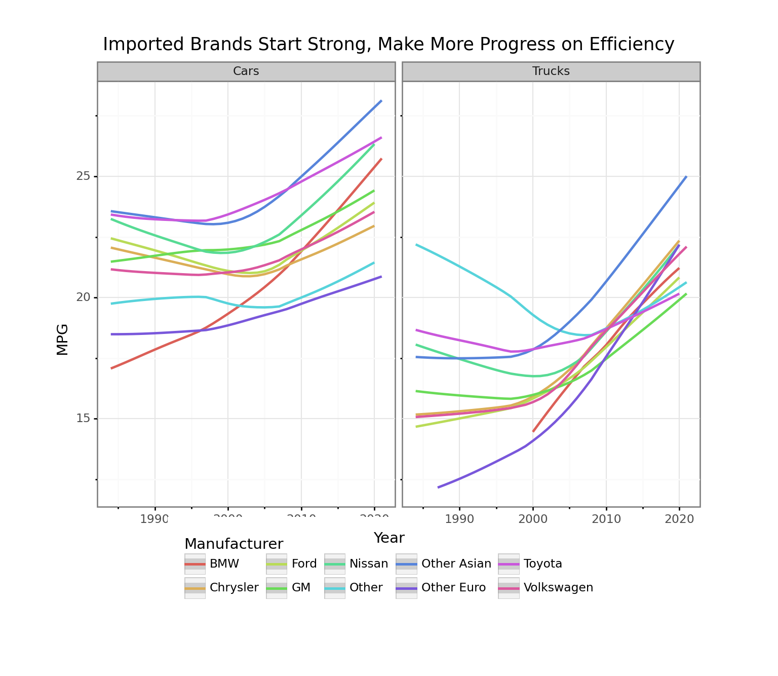
One thing to note is that it is difficult to tell which line maps to which make just by the colors. The original plan was to pipe this into plotly as we would do in R, but this functionality is not available. While the plotnine functionality is pretty close to ggplot, the lack of support of plotly is a pretty serious shortcoming.
From what we can see in the chart, we can see that “Other Asian” started out well in the beginning of the period, and made remarkable progress leaving Toyota behind as the leader in cars and trucks. Our family has driven Highlanders over the last 20 years, and seen the size of that model go from moderate to large, so it is not surprising to see Toyota trucks going from 2nd most to 2nd least efficient. BMW made the most progress of all producers in cars, and also made gains since introducing trucks in 2000. As a general comment, relative efficiency seems more dispersed and stable for cars than for trucks.
# Stacked line of number of models per manufacturer
(p9.ggplot(data[year < 2020, :].to_pandas(),
          p9.aes(x = 'year',
                 y= 'num_models',
                 fill = 'manufacturer')) +
          p9.geom_area(position = 'stack') +
          p9.theme_bw() +
          p9.labs(title = 'BMW Making a Lot of Car Models, While GM Streamlines',
                    x = 'Year',
                    y = 'Number of Models',
                    caption = 'EPA',
                    color = 'Manufacturer') +
          p9.facet_wrap('~vehicle_type',
                        ncol = 2,
                        scales= 'free') +
          p9.theme(
            subplots_adjust={'bottom': 0.25},
            figure_size=(8, 6), # inches
            aspect_ratio=1/0.7,    # height:width
            dpi = 200,
            legend_position='bottom',
            legend_direction='horizontal')
)
## <ggplot: (-9223372036538366460)>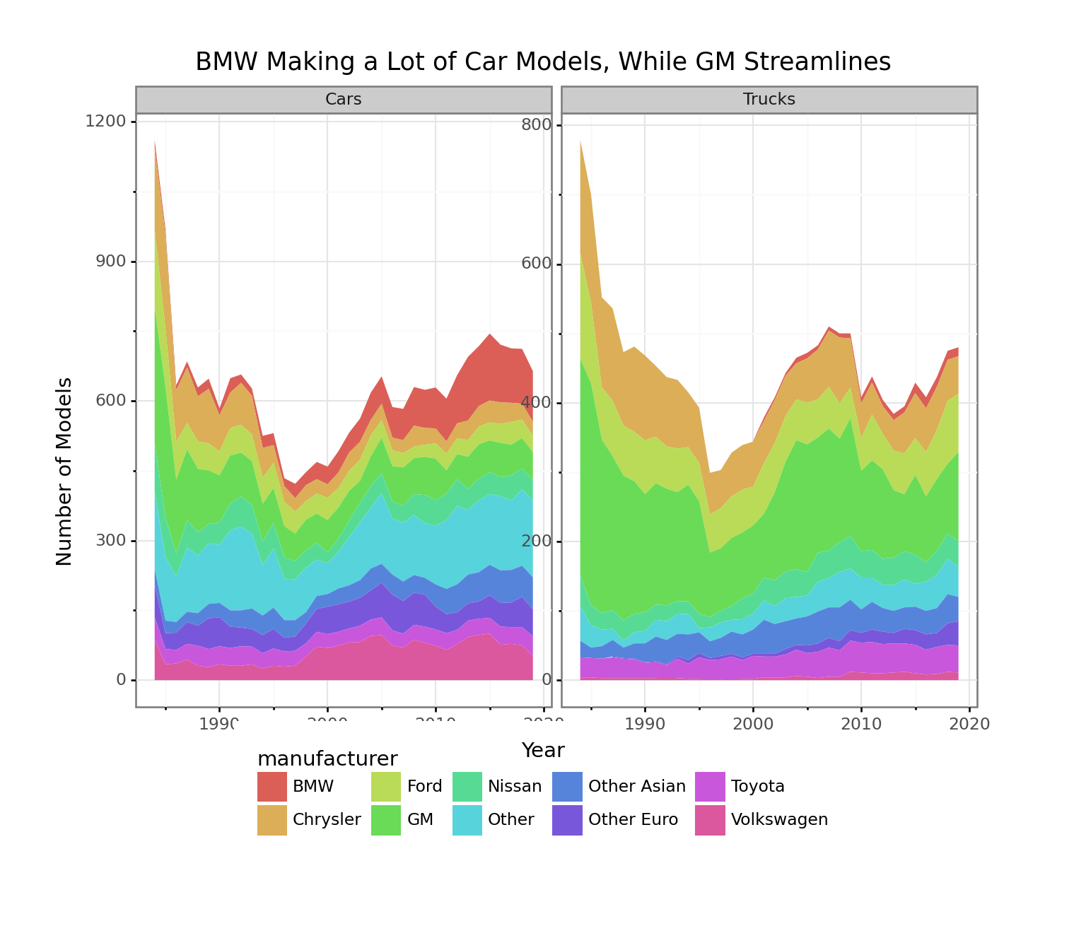
When we look number of models by Manufacturer , we can see that the number of models declined steadily from 1984 though the late 1990s, but has been rising since. Although the number of truck models appear to be competitive with cars, note that the graphs have different scales so there are about 2/3 as many in most years. In addition to becoming much more fuel efficient, BMW has increased the number of models to an astonishing degree over the period, even while most other European imports have started to tail off (except Mercedes). We would be interested to know the story behind such a big move by a still niche US player. GM had a very large number of car and truck models at the beginning of the period, but now has a much more streamlined range. It is important to remember that these numbers are not vehicles sold or market share, just models tested for fuel efficiency in a given year.
Electric Vehicles Unsurprisingly Get Drastically Better Mileage
After the looking at the efficiency by manufacturer in Figure ?? above, we had a double-take when we saw the chart Figure ?? below. While progress for gas-powered vehicles looked respectable above, in the context of cars with batteries, gas-only vehicles are about half as efficient on average. Though the mean improved, the mileage of the most efficient gas powered vehicle in any given year steadily lost ground over the period.
Meanwhile, vehicles with batteries are not really comparable because plug-in vehicles don’t use any gas. The EPA imputes energy equivalence for those vehicles. The EPA website explains in Electric Vehicles: Learn More About the Label that a calculation of equivalent electricity to travel 100 miles for plug-in vehicles. This seems like a crude comparison as electricity prices vary around the country. Still, the most efficient battery-powered car (recently a Tesla) improved to an incredible degree.
Around 2000, there were only a handful of battery-powered cars so the error bars would be wide if included, and we are counting all cars with any battery as one category when there are hybrids and plug-ins. In any case, caution should be used in interpreting the trend, but there was a period where the average actually declined, and really hasn’t improved over 20-years with the most efficient.
# Prepare data for charting by gas and battery-powered
data = big_mt[ (vehicle_type == "Cars"), :][:,
                { "maximum": dt.max(comb08),
                  "mean" : dt.mean(comb08),
                  "minimum": dt.min(comb08),
                  "num_models" : dt.count() },
                    by(year, is_ev)]

# Reshape
data = data.to_pandas().melt(
                  id_vars=["year",
                           "is_ev",
                           "num_models"],
                  value_vars=["maximum",
                              "mean",
                              "minimum"],
                  var_name = "Description",
                  value_name = "MPG")

# Facet plot smoothed line for gas and battery-powered
(p9.ggplot(
    data,
    p9.aes('year',
           'MPG',
           group = 'Description',
           color = 'Description')) +
    p9.geom_smooth() +
    p9.facet_wrap('~ is_ev') +
    p9.labs(
      title = 'Gas Powered Cars Make Little Progress, While EV Driven by Most Efficient',
      x = 'Year'
    ) +
    p9.theme_bw() +
    p9.theme(
      subplots_adjust={'right': 0.85},
      figure_size=(10, 8), # inches
      aspect_ratio=1/1,    # height:width
      legend_position='right',
      legend_direction='vertical')
)
## <ggplot: (-9223372036539532512)>
##
## /Users/davidlucey/Library/r-miniconda/envs/r-reticulate/lib/python3.6/site-packages/plotnine/stats/smoothers.py:168: PlotnineWarning: Confidence intervals are not yet implementedfor lowess smoothings.
## "for lowess smoothings.", PlotnineWarning)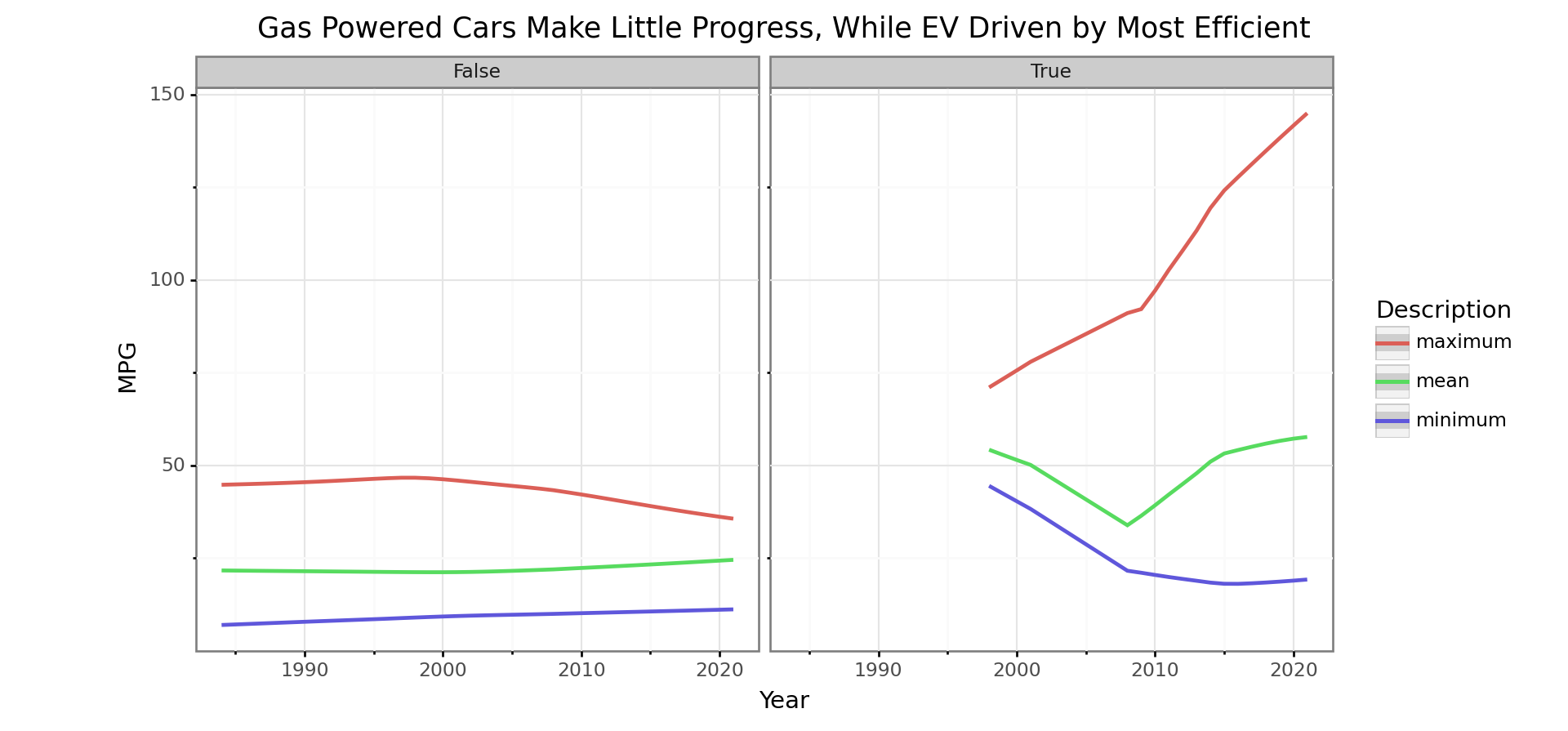
Efficiency of Most Vehicle Types Started Improving in 2005
In Figure We were surprised to see the fuel efficiency of mid-sized overtake even small cars as the most efficient around 2012. Small pickups and SUV’s also made a lot of progress as did standard pick-up trucks. Sport Utility Vehicles were left behind by the improvement most categories saw since 2005, while vans steadily lost efficiency over the whole period. As mentioned earlier, we noticed that the same model SUV that we owned got about 20% larger over the period. It seems like most families in our area have at least oneSUV, but they didn’t really exist before 2000.
# Prepare data for plotting smoothed line by VClass
data = big_mt[(is_ev == False), :][:,
                {'mean' : dt.mean(comb08),
                 'num_models' : count() },
                    by(year, VClass, is_ev)].to_pandas()

# Plot smoothed line of efficiency by VClass
(p9.ggplot(
    data,
    p9.aes('year',
           'mean',
           group = 'VClass',
           color = 'VClass')) +
            p9.geom_smooth() +
            p9.labs(
                title = "Midsize Cars Pull Ahead in Efficiency",
                y = 'MPG',
                x = 'Year') +
            p9.theme_bw()  +
    p9.theme(
      subplots_adjust={'right': 0.75},
      figure_size=(10, 4), # inches
      aspect_ratio=1/1.5,    # height:width
      legend_position='right',
      legend_direction='vertical')
)
## <ggplot: (-9223372036539214581)>
##
## /Users/davidlucey/Library/r-miniconda/envs/r-reticulate/lib/python3.6/site-packages/plotnine/stats/smoothers.py:168: PlotnineWarning: Confidence intervals are not yet implementedfor lowess smoothings.
## "for lowess smoothings.", PlotnineWarning)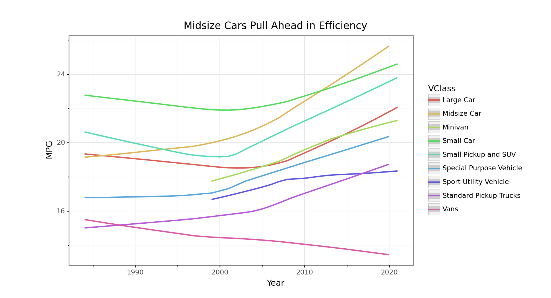
Efficiency by Fuel Type
We can see that fuel efficiency of electric vehicles almost doubled over the period, while we didn’t see the average efficiency of vehicles with batteries make the same improvement. We generated our is_ev battery if the car had a battery, but didn’t specify if it was plug-in or hybrid, so this discrepancy may have something to do with this. We can also see efficiency of diesel vehicles comes down sharply during the 2000s. We know that Dieselgate broke in 2015 for vehicles sold from 2009, so it is interesting to see the decline in listed efficiency started prior to that period. Natural gas vehicles seem to have been eliminated five years ago, which is surprising with the natural gas boom.
# Prepare data for plotting by fuelType1
data = big_mt[: ,
              { 'maximum': dt.max(comb08),
                'minimum': dt.min(comb08),
                'num_models' : count(),
                'mpg' : dt.mean(comb08) },
                  by(year, fuelType1)].to_pandas()

# Plot smoothed line of efficiency by fuelType1 by VClass
(p9.ggplot(data,
            p9.aes('year',
                   'mpg',
                   color='fuelType1')) +
            p9.geom_smooth() +
            p9.theme_bw() +
            p9.labs(
                title = "Efficiency of Electric Vehicles Takes Off",
                y = 'MPG',
                x = 'Year',
                color='Fuel Type') +
            #p9.geom_hline(aes(color="Overall mean")) +
            p9.theme(
              subplots_adjust={'right': 0.75},
              figure_size=(10, 4), # inches
              aspect_ratio=1/1.5,    # height:width
              legend_position='right',
              legend_direction='vertical')
)
## <ggplot: (315895777)>
##
## /Users/davidlucey/Library/r-miniconda/envs/r-reticulate/lib/python3.6/site-packages/plotnine/stats/smoothers.py:168: PlotnineWarning: Confidence intervals are not yet implementedfor lowess smoothings.
## "for lowess smoothings.", PlotnineWarning)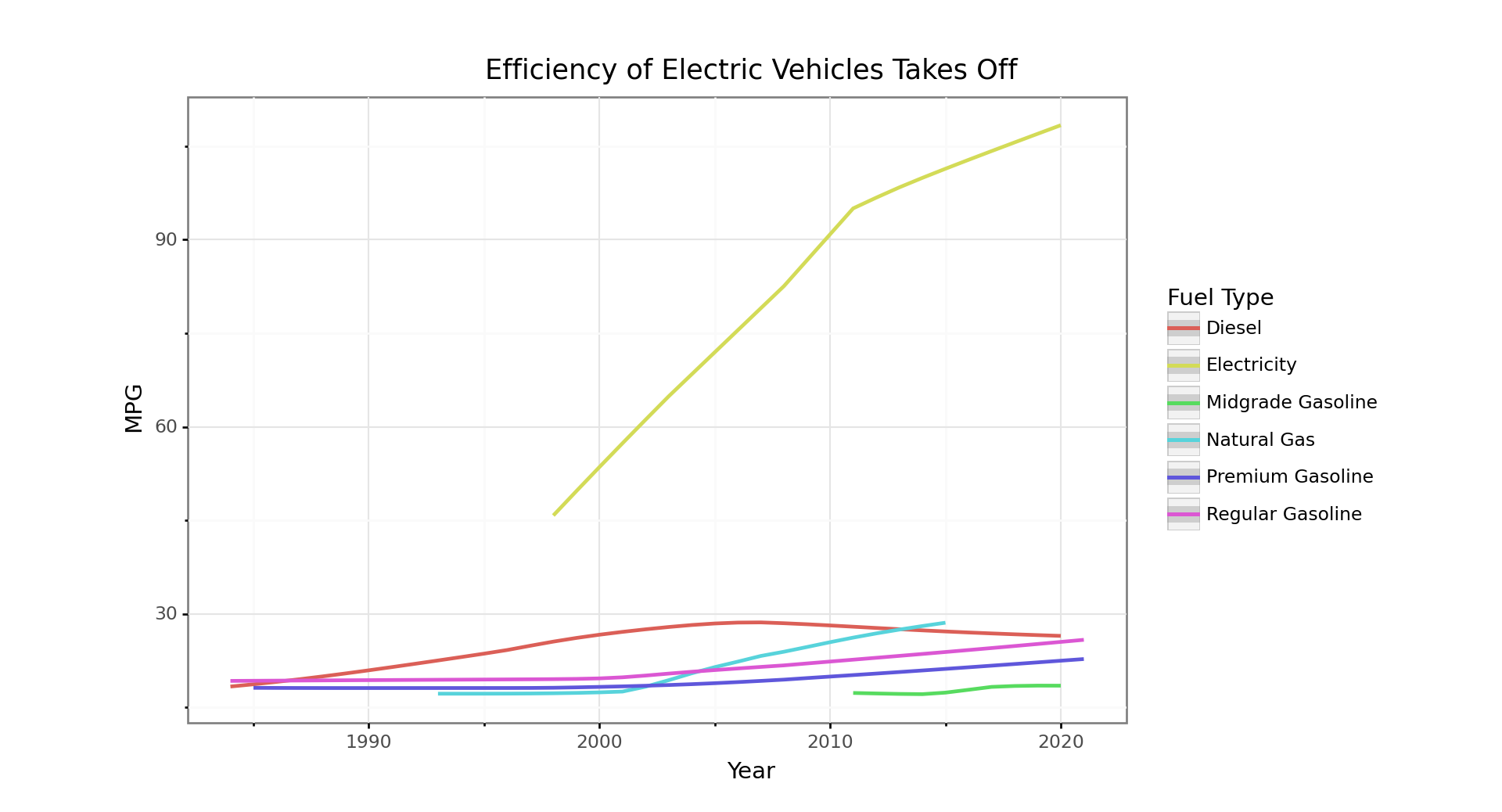
We don’t know if fuelType1 refers to the recommended or required fuel, but didn’t realize that there had been such a sharp increase in premium over the period. Our understanding was that premium gasoline had more to do with the engine performance than gas efficiency. it is notable that despite all the talk about alternative fuels, they can still be used in only a small minority of new models.
# Plot stacked line of share of fuelType1 by VClass
(p9.ggplot(data[data['year'] < 2020],
            p9.aes('year',
                   'num_models',
                   fill = 'fuelType1')) +
            p9.geom_area(position = 'stack') +
            p9.theme_bw() +
            p9.labs(
                title = "Number of Cars and Trucks Requiring Premium Overtakes Regular",
                y = 'Number of Models',
                x = 'Year',
                fill = 'Fuel Type') +
            p9.theme(
              subplots_adjust={'right': 0.75},
              figure_size=(10, 4), # inches
              aspect_ratio=1/1.5,    # height:width
              legend_position='right',
              legend_direction='vertical')
)
## <ggplot: (315890906)>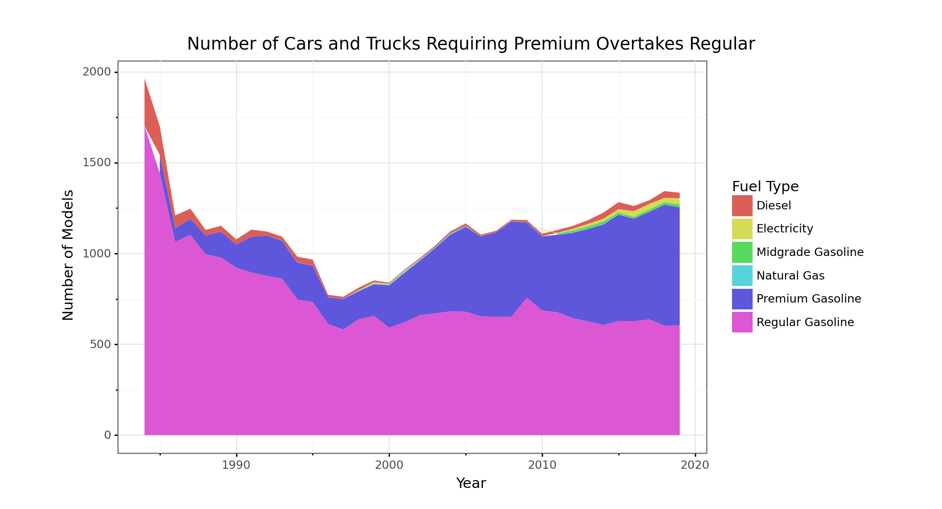
Conclusion
There is a lot of complexity in this system and more going on than we are likely to comprehend in a short exploration. We know there is a regulatory response to the CAFE standards which tightened in 2005, and that at least one significant producer may not have had accurate efficiency numbers during the period. The oil price fluctuated widely during the period, but not enough to cause real change in behavior in the same way it did during the 1970s. We also don’t know how many vehicles of each brand were sold, so don’t know how producers might jockey to sell more profitable models within the framework of overall fleet efficiency constraints. There can be a fine line between a light truck and a car, and the taxation differentials importation of cars vs light trucks are significant. Also, the weight cutoffs for trucks changed in 2008, so most truck categories are not a consistent weight over the whole period. That is all for now, but a future post might involve scraping CAFE standards, where there is also long term data available, to see if some of the blanks about volumes and weights could be filled in to support more than just exploratory analysis.
Comments About Plotnine and Python Chunks in RStudio
In addition to the charts rendering smaller than we would have liked, we would have liked to have figure captions (as we generally do in for our R chunks). In addition, our cross-referencing links are currently not working for the Python chunks as they would with R. There is a bug mentioned on the
knitrnews page which may be fixed when the 1.29 update becomes available.